Kitchen colour basics: building a scheme that works in real light
Colour is where many kitchen projects stall. A paint chip that looked perfect in the shop turns out too yellow next to the countertop; a white that seemed crisp reads grey on a north wall. The problem is rarely taste. It is that kitchens combine many fixed colours — stone, wood, tile, stainless steel — under light that changes all day. A little colour theory and a disciplined way of testing samples avoid most disappointments.
Three properties of any colour
- Hue is the colour family: red, yellow, green, blue and so on.
- Value is how light or dark the colour is. Contrast in value — dark lower cabinets against pale walls, for example — is what the eye registers first, often more than hue.
- Saturation (or chroma) is how intense the colour is. Most successful kitchen colours are muted: a greyed green or a softened blue is easier to live with on large surfaces than a pure, saturated one.
Then there is undertone: the subtle bias of a neutral. Whites, greys and beiges lean warm (towards yellow, red or pink) or cool (towards blue or green). Undertones are why two "whites" can clash and why a grey wall can look lilac beside a warm granite. Holding samples against a sheet of plain white paper helps reveal them.
Start from what you cannot change
Countertops, flooring, tile and appliance finishes are expensive and long-lived; paint is cheap and easy to redo. So build the scheme in that order. Collect real samples of the fixed materials, look for their dominant undertone — warm cream in a granite, cool grey veining in a marble-look quartz, yellow or red in an oak floor — and choose paint colours that share or deliberately complement it.
Many designers use the loose "60-30-10" proportion as a starting point: a dominant colour on about 60 percent of the visible surfaces (often walls and wall cabinets), a secondary colour on about 30 percent (base cabinets, an island, the floor), and an accent on about 10 percent (hardware, a tile band, textiles). It is a rule of thumb, not a law, but it helps prevent a room where every surface competes.
Light reflectance value
Paint manufacturers publish a light reflectance value (LRV) for each colour: a figure from 0 (absorbs all light) to 100 (reflects all light). Most whites fall roughly between 80 and 90; mid-tones sit around 40 to 60; deep colours fall below 20. LRV is a useful tool in a kitchen because it predicts how bright the room will feel. In a dark, north-facing kitchen, keeping the large surfaces at a higher LRV helps; in a bright room, a deep colour on the lower cabinets will not make the space gloomy.
How light changes colour
Daylight differs by orientation. In the northern hemisphere, north-facing rooms receive cool, indirect light that tends to make colours look bluer and greyer; south-facing rooms get warm, strong light for much of the day; east and west rooms change dramatically between morning and evening. Warm colours can balance a cool north light, while cooler colours can calm a hot west-facing room.
Artificial light matters just as much, because kitchens are used after dark. LED lamps are sold by colour temperature, measured in kelvin (K). The US Department of Energy describes lower values (around 2700–3000 K) as warm, yellowish light and higher values (4000 K and above) as cooler, bluer light. Mixing colour temperatures in one room makes surfaces look patchy, so choose one for the whole kitchen. Also look at the colour rendering index (CRI): lamps with a higher CRI render the colours of food, wood and paint more faithfully. A CRI of 90 or above is a sensible target for a kitchen.
Choosing sheen
Sheen affects both appearance and cleaning. Flat and matte finishes hide surface imperfections but mark easily; eggshell and satin are more washable and are common choices for kitchen walls; semi-gloss and gloss resist moisture and scrubbing best and suit trim, doors and cabinets, but they show every dent and brush mark. For cabinets, specialised enamels or factory-applied finishes are generally more durable than standard wall paint.
Ask for low- or zero-VOC paint. The US Environmental Protection Agency notes that paints can release volatile organic compounds while drying, and recommends ventilating well during and after painting.
Testing samples properly
- Narrow the choice to two or three colours using chips held against your countertop, floor and tile samples.
- Paint large samples — at least the size of a sheet of A3 or tabloid paper — on boards or directly on the wall. Small chips exaggerate darkness and hide undertone.
- Place each sample in several spots: beside the window, in the darkest corner, next to the countertop.
- Look at them in the morning, at midday, in the evening and with the kitchen lights on.
- Live with the samples for a few days. The right colour is often the one you stop noticing.
Common colour schemes
- Monochromatic: several values of one hue, such as pale sage walls with deeper green cabinets. Calm and easy to get right.
- Analogous: neighbouring hues on the colour wheel, such as blue-green and green. Harmonious, slightly richer.
- Complementary: opposite hues, such as navy cabinets with warm brass and terracotta. Lively; usually works best when one colour clearly dominates.
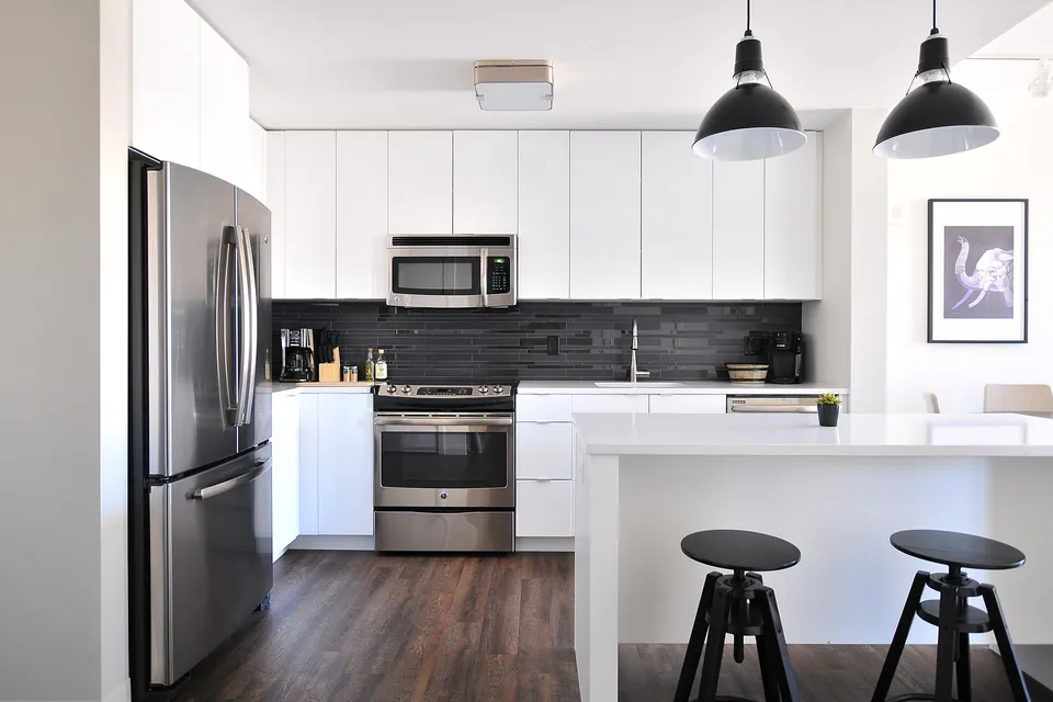
- Neutral with one accent: whites, wood and stone, with colour concentrated on an island or a tiled wall. Flexible and easy to update.
Decorating without repainting
Our guide to kitchen decorating solutions covers these ideas at length; lighting gets its own article on decorative kitchen lighting.
If repainting cabinets or retiling is not on the cards, colour can still change a kitchen: new hardware in a warmer or cooler metal, a runner or blind, a shelf of coloured ceramics, or switching every lamp to the same colour temperature. These small, reversible decisions are also a low-risk way to test a palette before committing to paint.
Sources
- US Department of Energy, Energy Saver, "Lighting Choices to Save You Money" and LED lighting guidance (colour temperature, colour rendering).
- US Environmental Protection Agency, "Volatile Organic Compounds' Impact on Indoor Air Quality".
- Paint manufacturers' published light reflectance values.
Last reviewed: 6 November 2026.